Client
The Gund
Services
Visual identity
Digital strategy
Web design
Development
Campaign
Sector
Arts & culture
The Gund at Kenyon College in Ohio has launched a new brand identity. The new name and fresh look reflect the breadth of initiatives, spaces, and programming—on campus and beyond, placing The Gund “in the middle of everywhere”.
The new name marks a profound transformation as the organization enters its second decade, poised to establish a more significant presence on the global art scene.
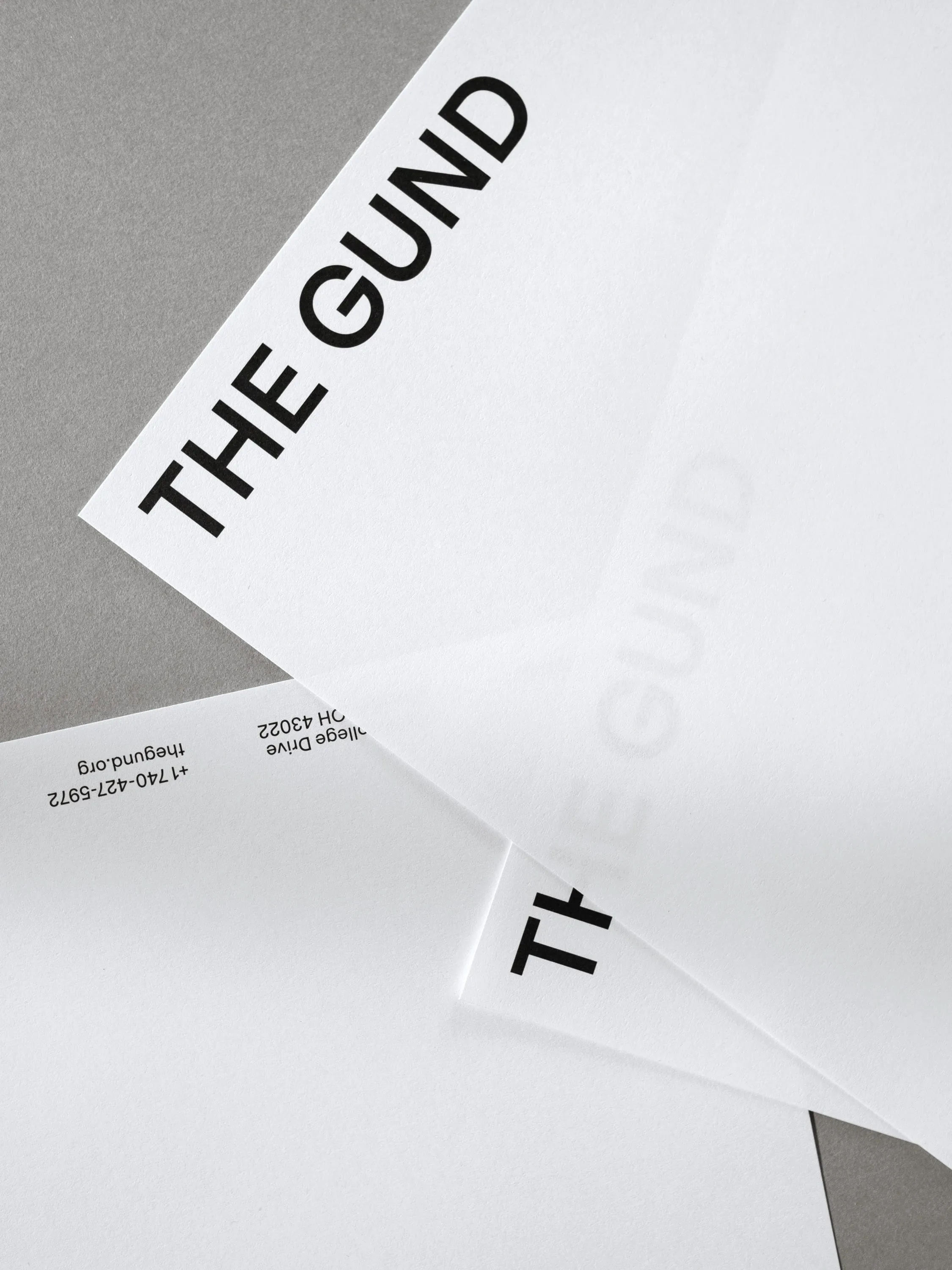

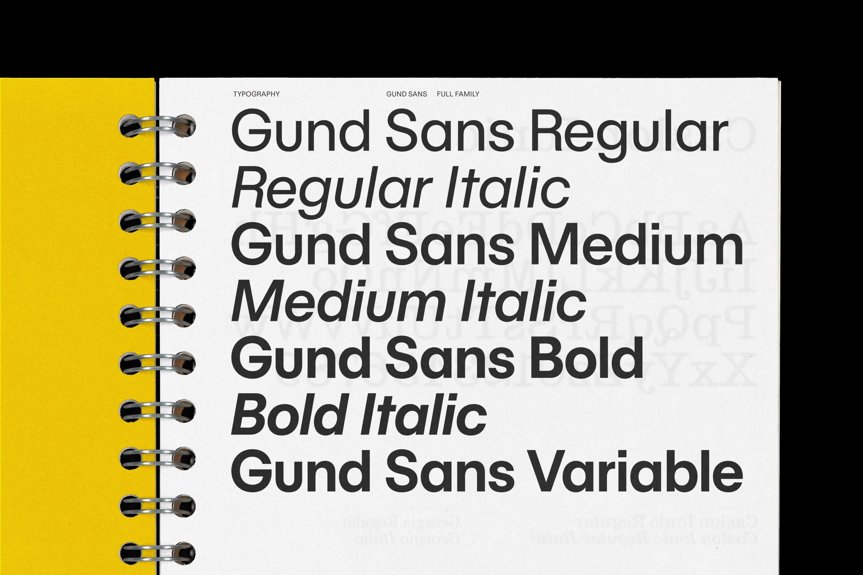
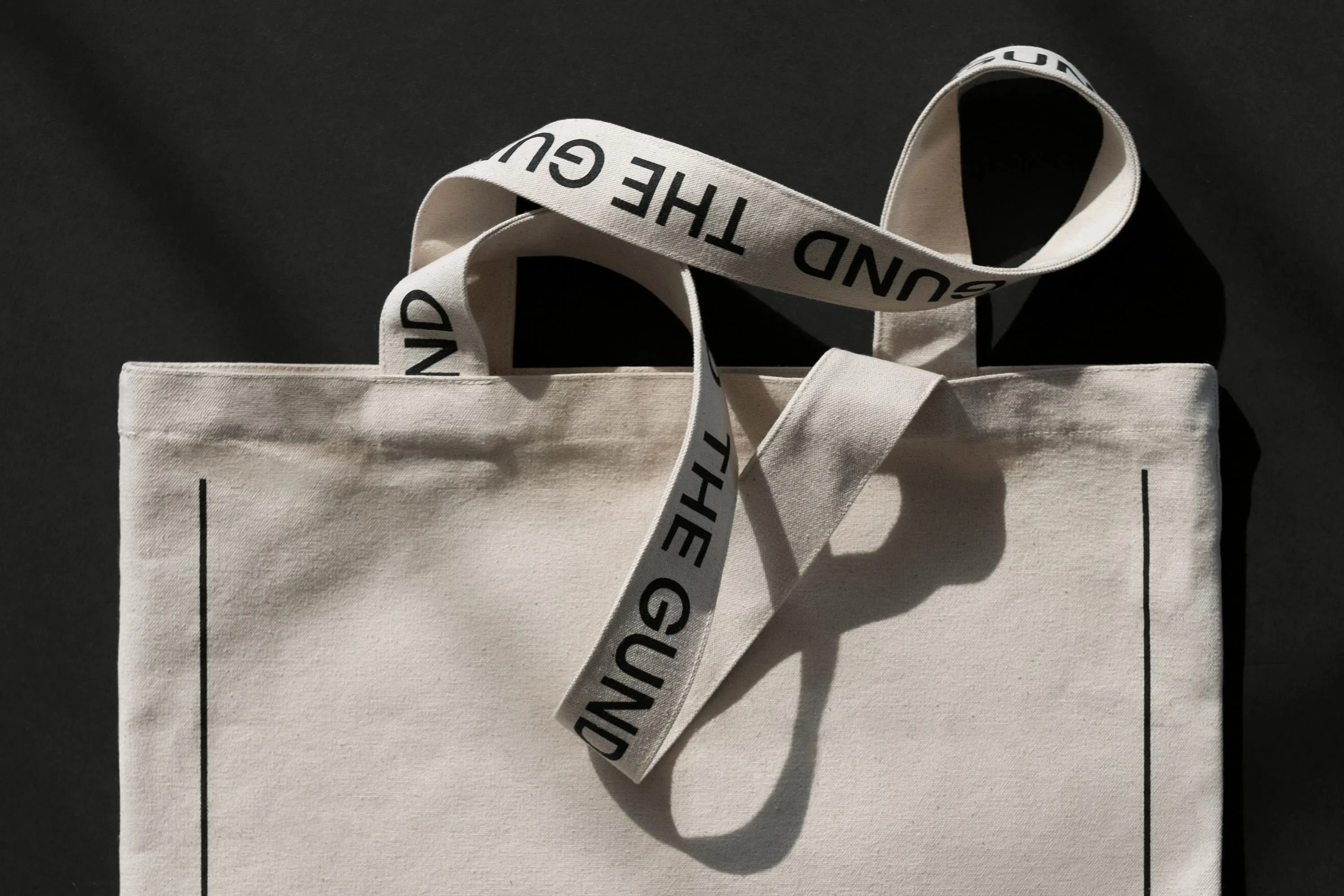
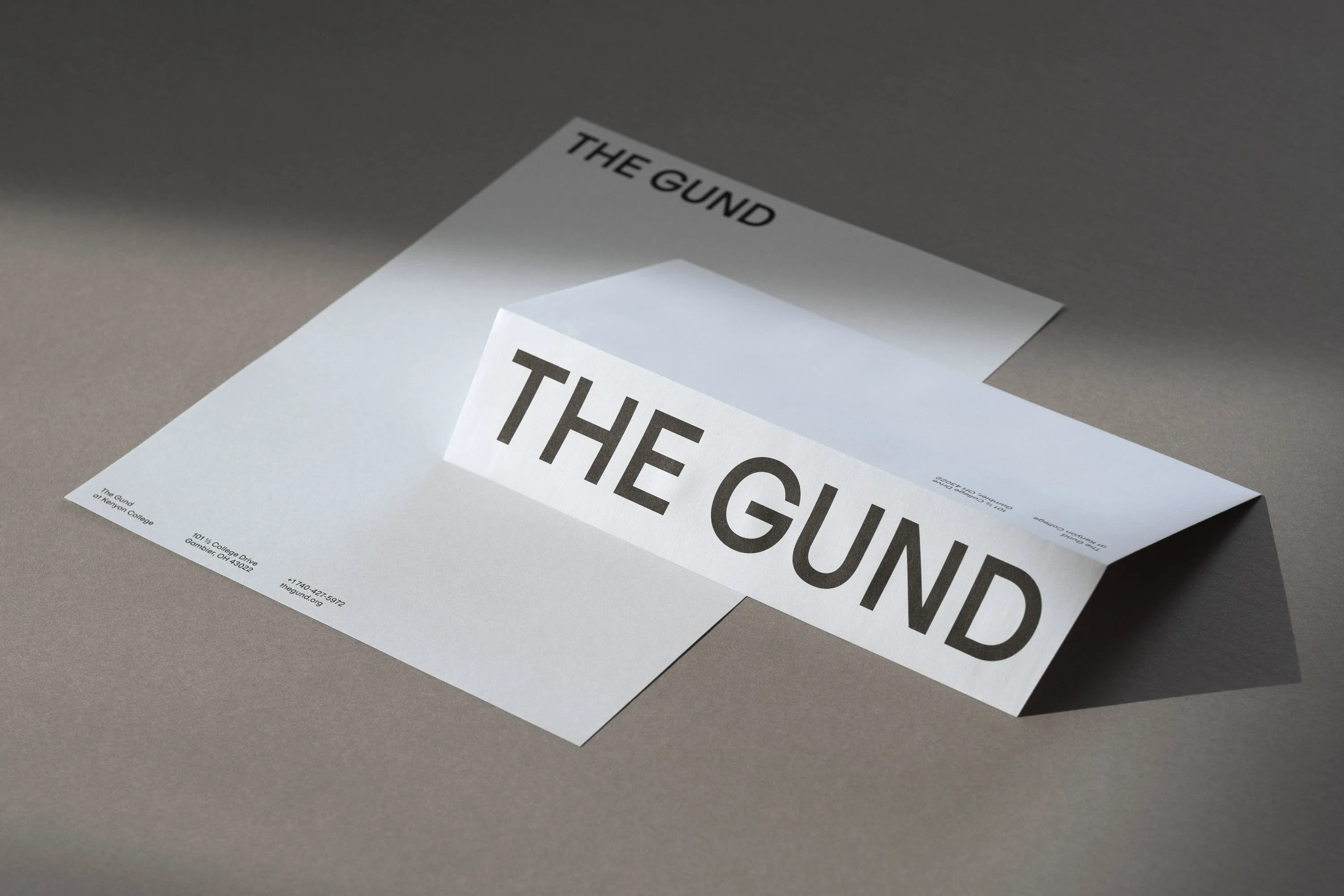
Friendly and inviting, Gund Sans was custom-designed to become the main font of the identity, and with its three weights and complementary italics, it is the main voice of the brand.
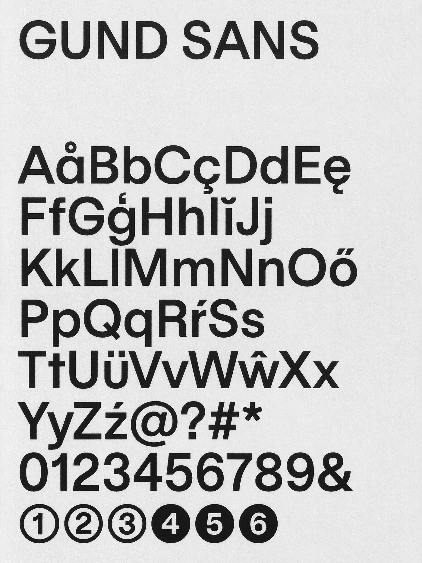
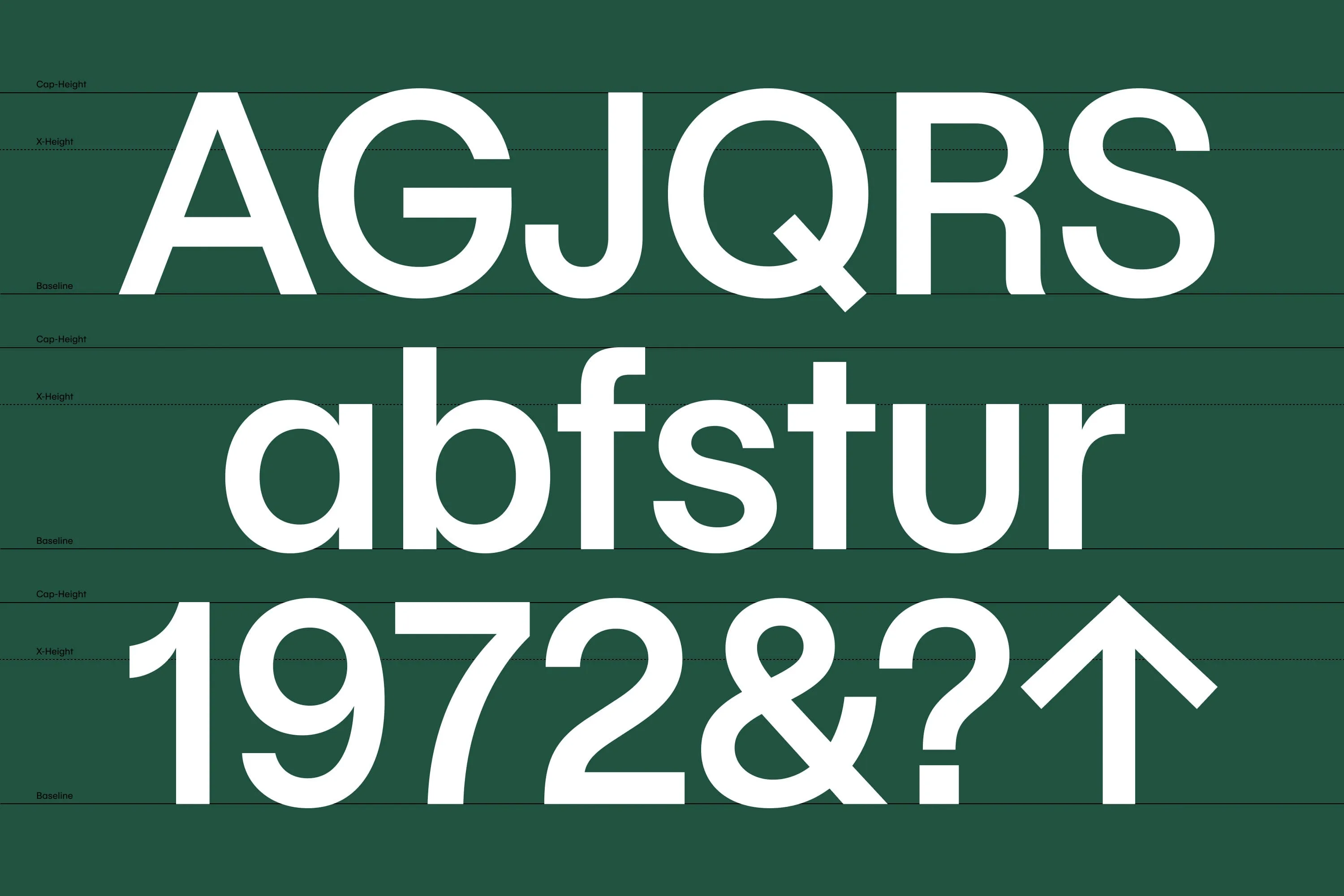


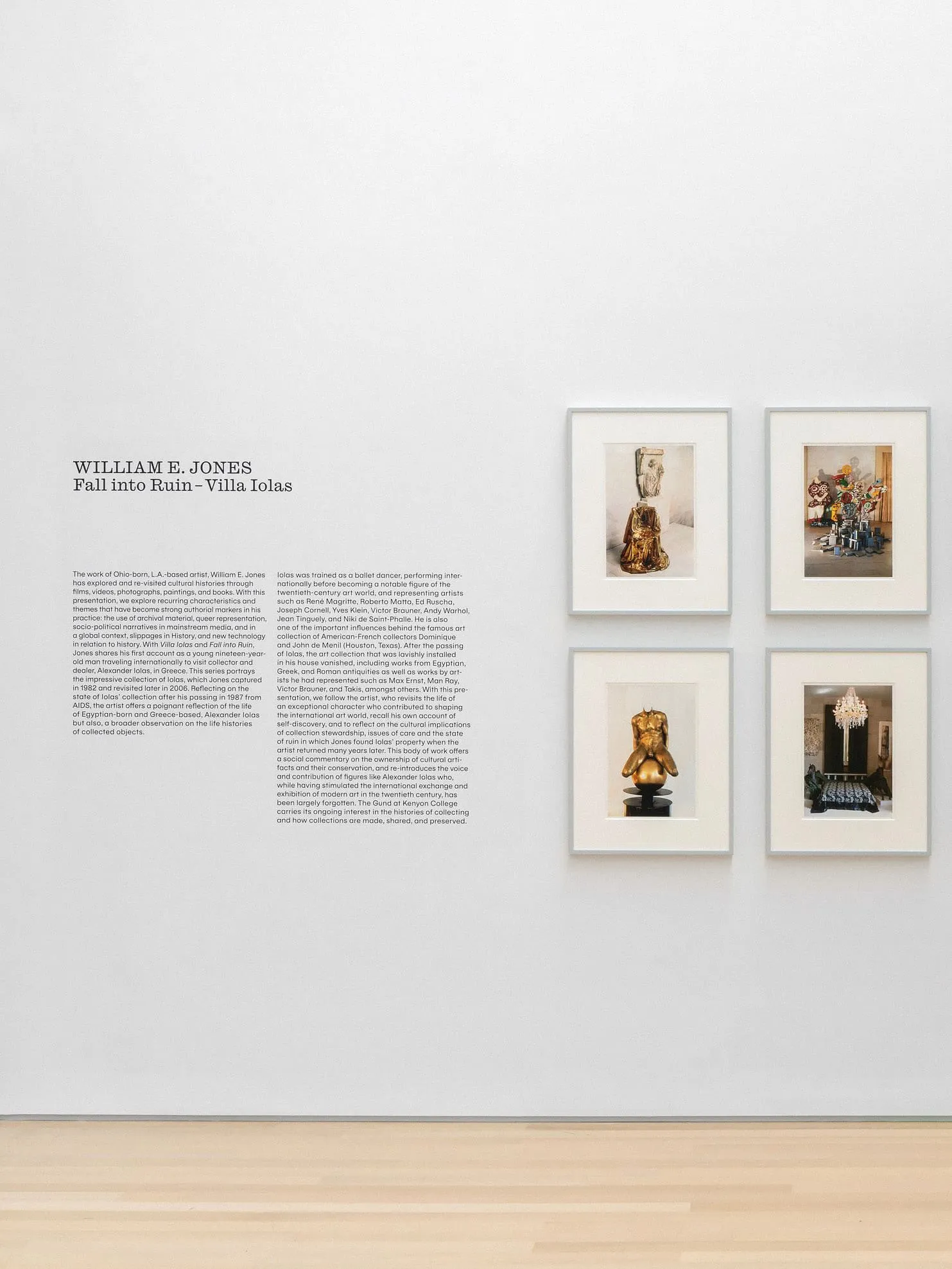
The graphic system acts as a “design expression dimmer” ranging from restrained to expressive, allowing the gallery to express itself and for the artists’ work to remain the focus. Friendly and welcoming, Gund Sans was created as a primary typeface.

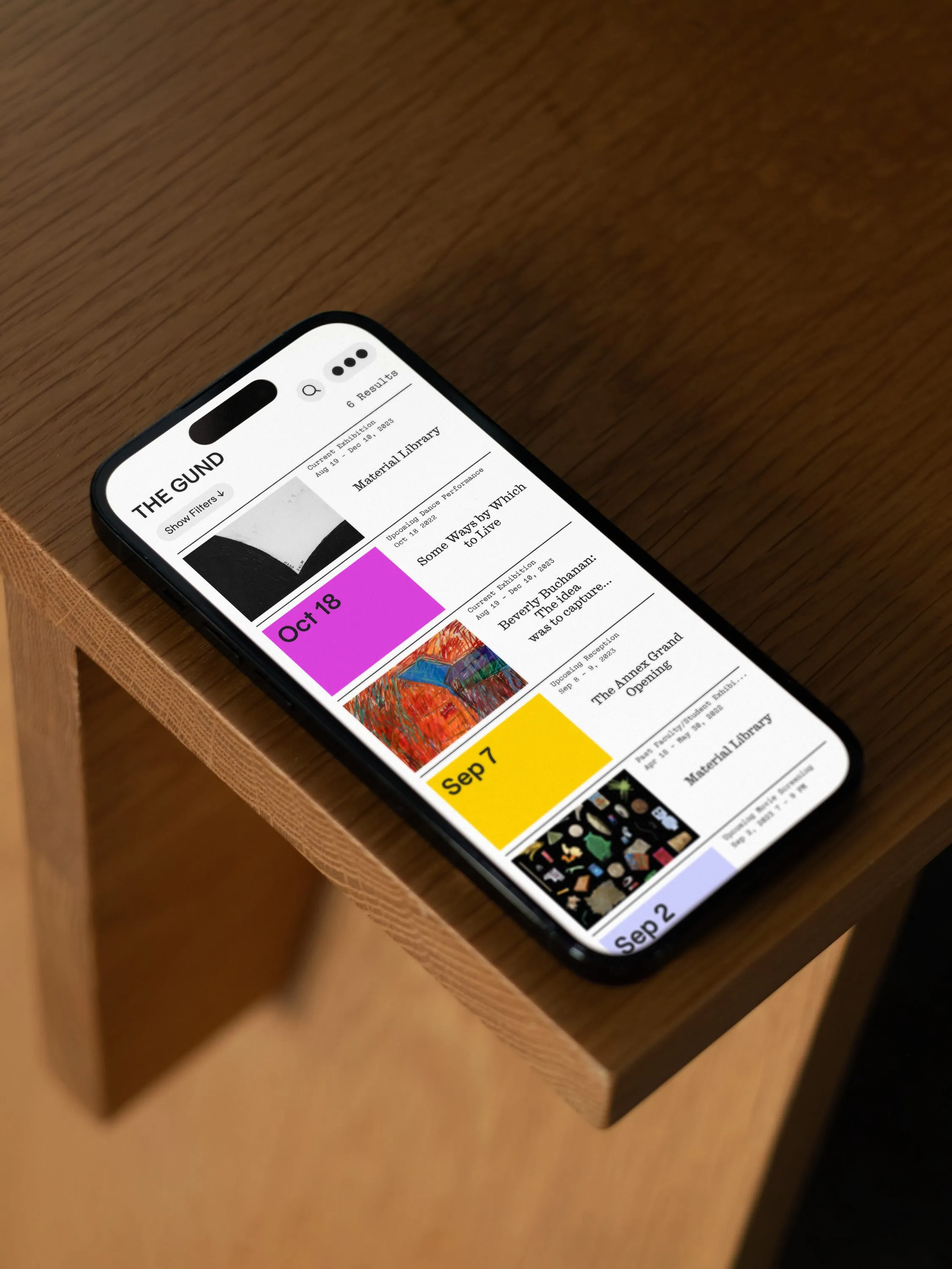
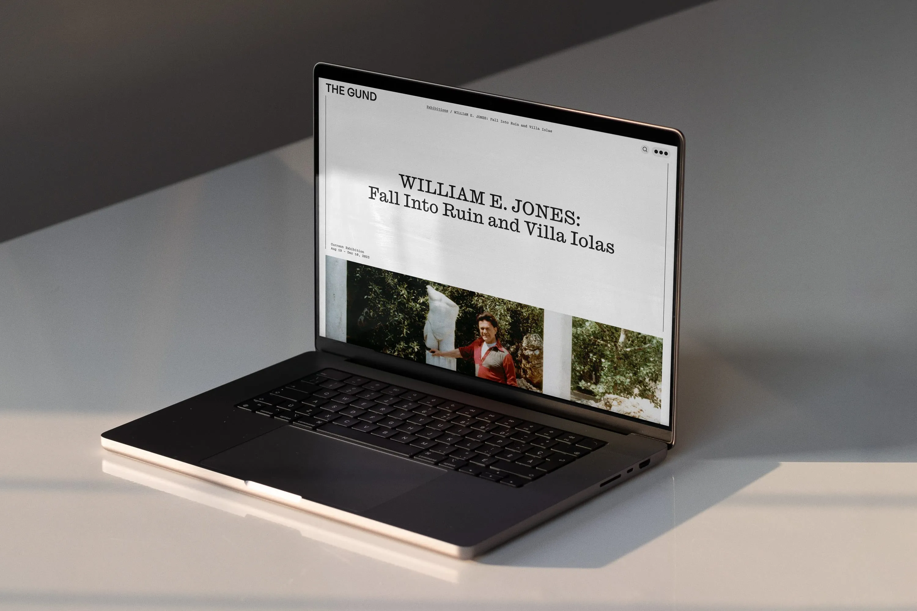
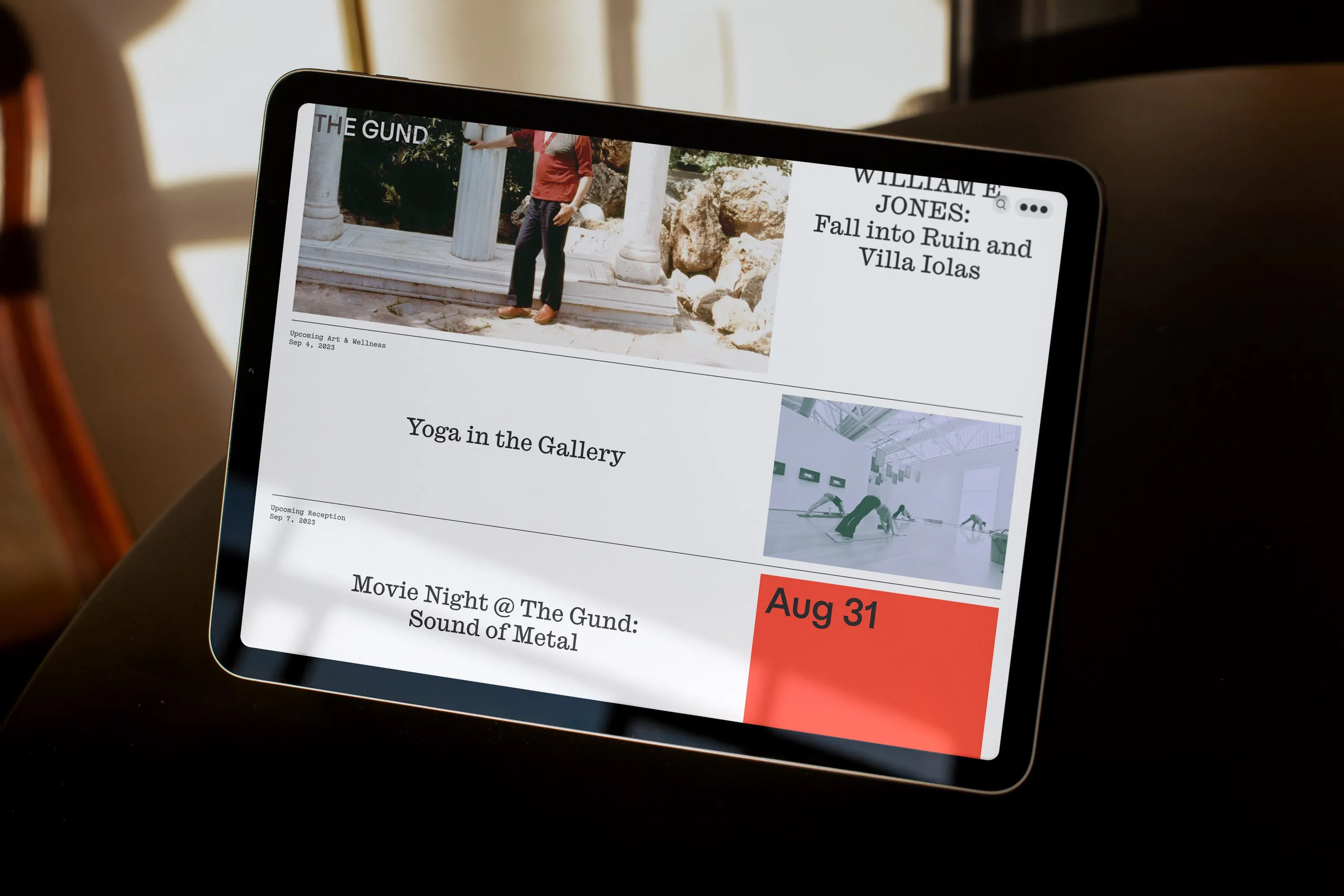
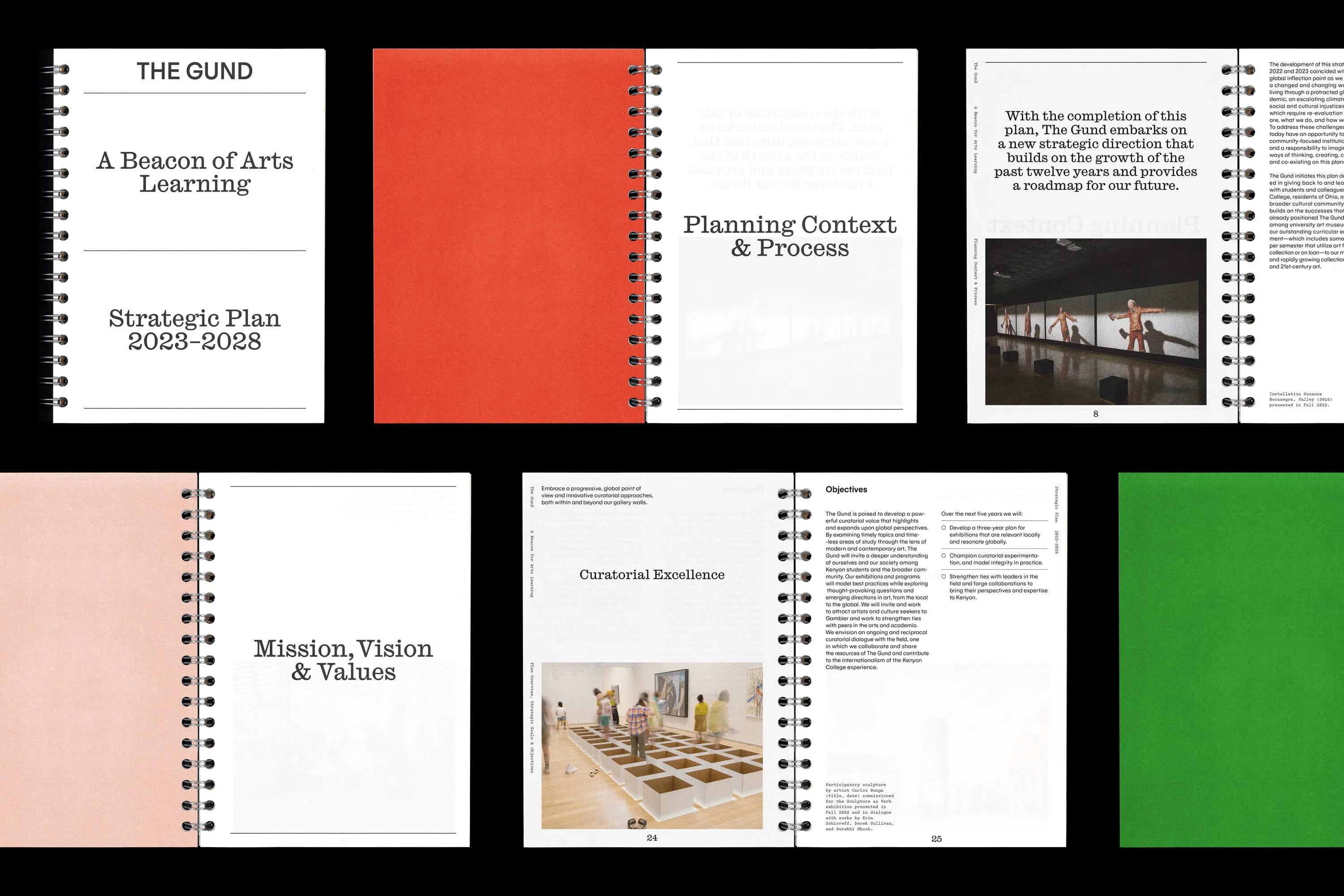
This new digital platform will ensure the dissemination of the museum's innovative initiatives. It acts as The Gund’s “second building,” functioning as a lively hub for students, visitors, and the local community. It also serves as a platform to amplify the institution’s voice and engage with the broader art world, attracting new artists and fostering connections.

“Principal’s contribution was absolutely key to the strategic and creative success of this project, and the unwavering support of the charming, dedicated and inspired team made this journey an absolute joy.” –Daisy Desrosiers, director and chief curator, The Gund
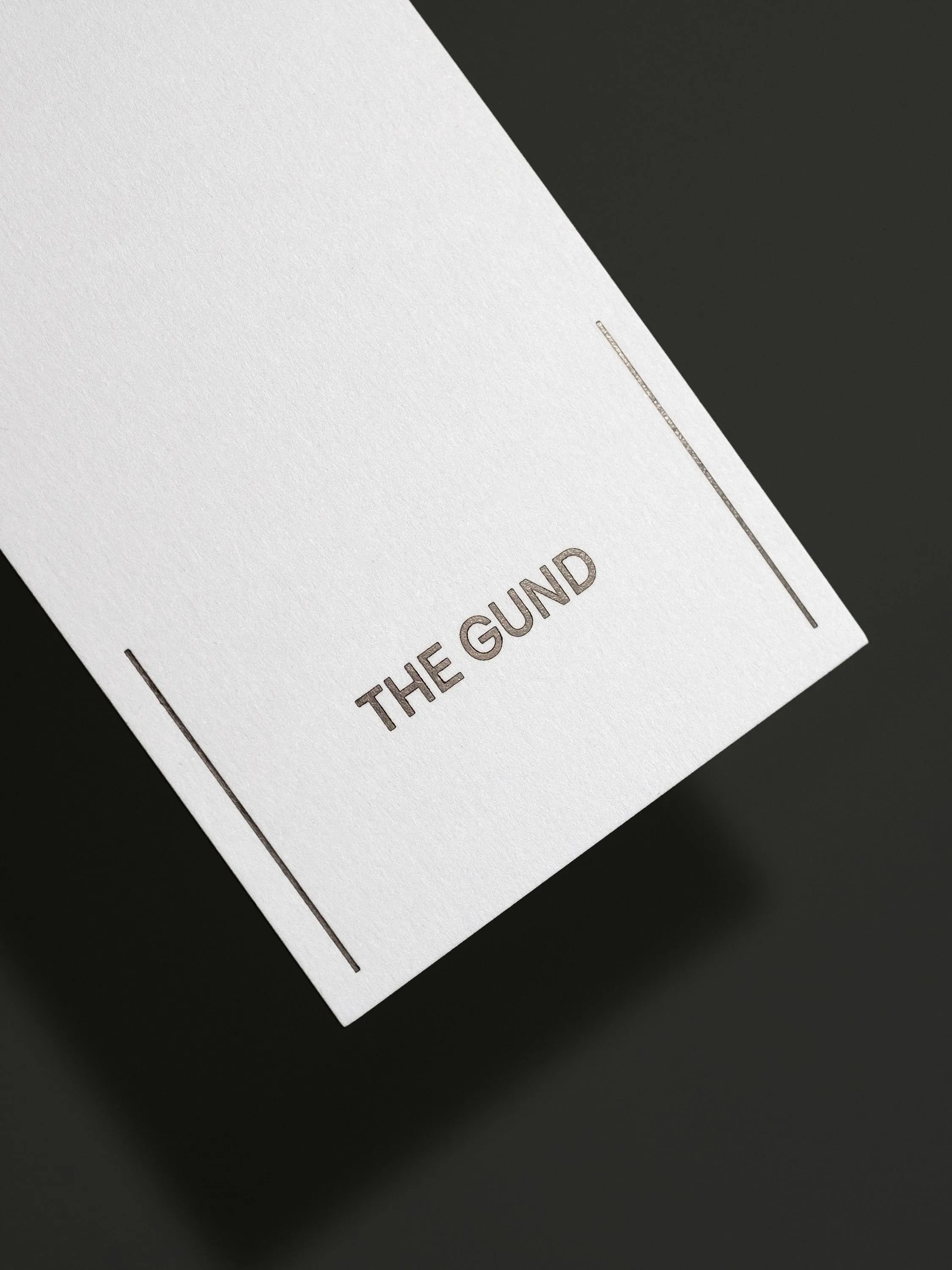
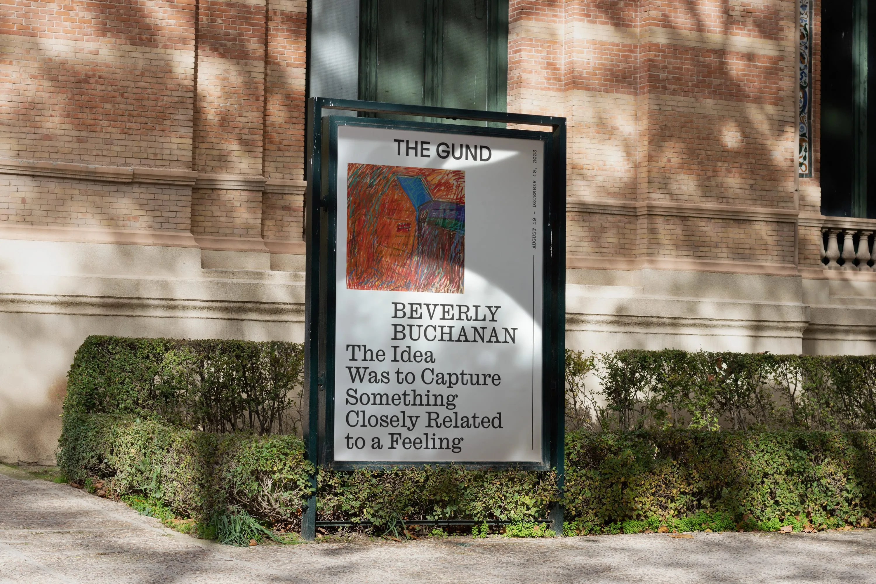
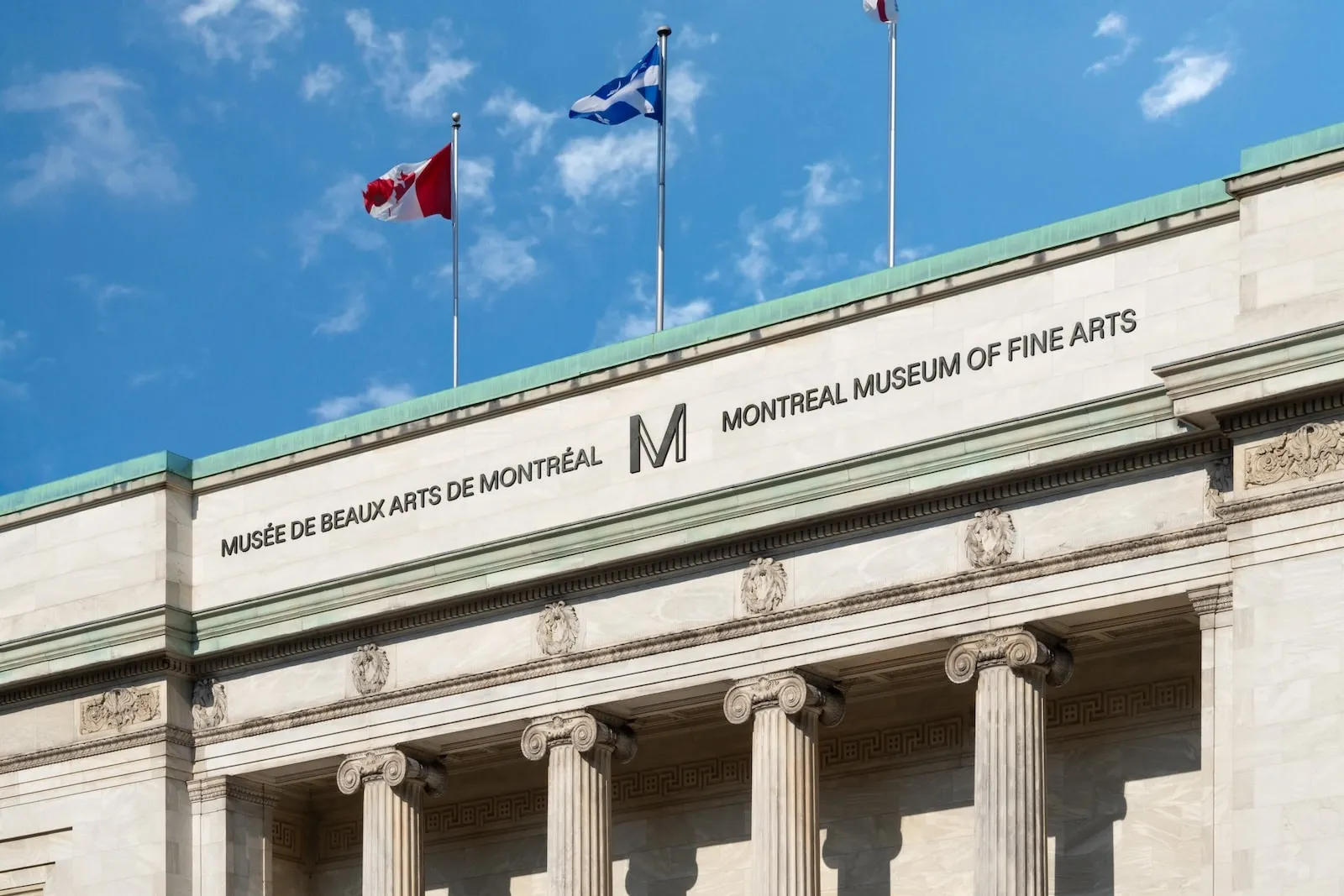
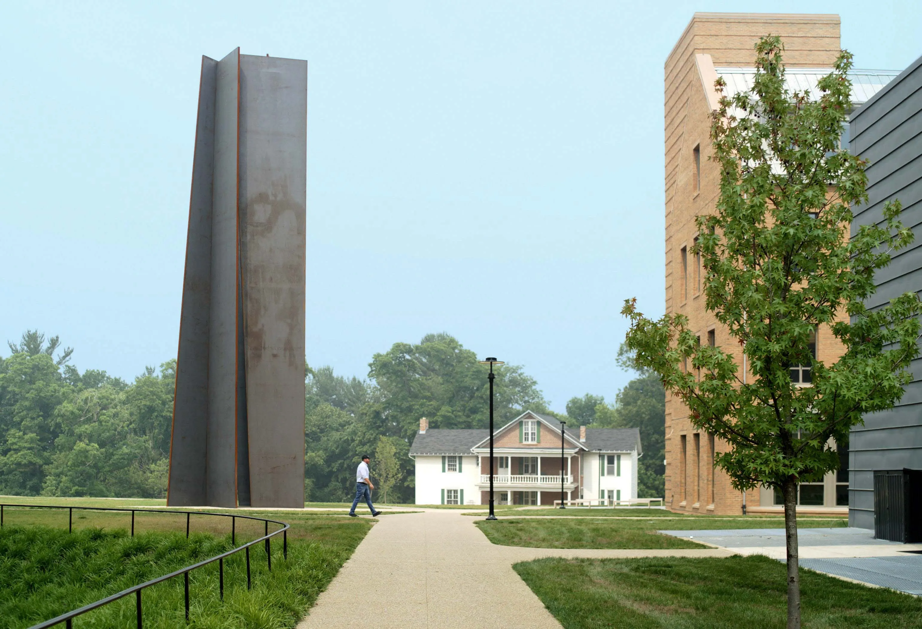
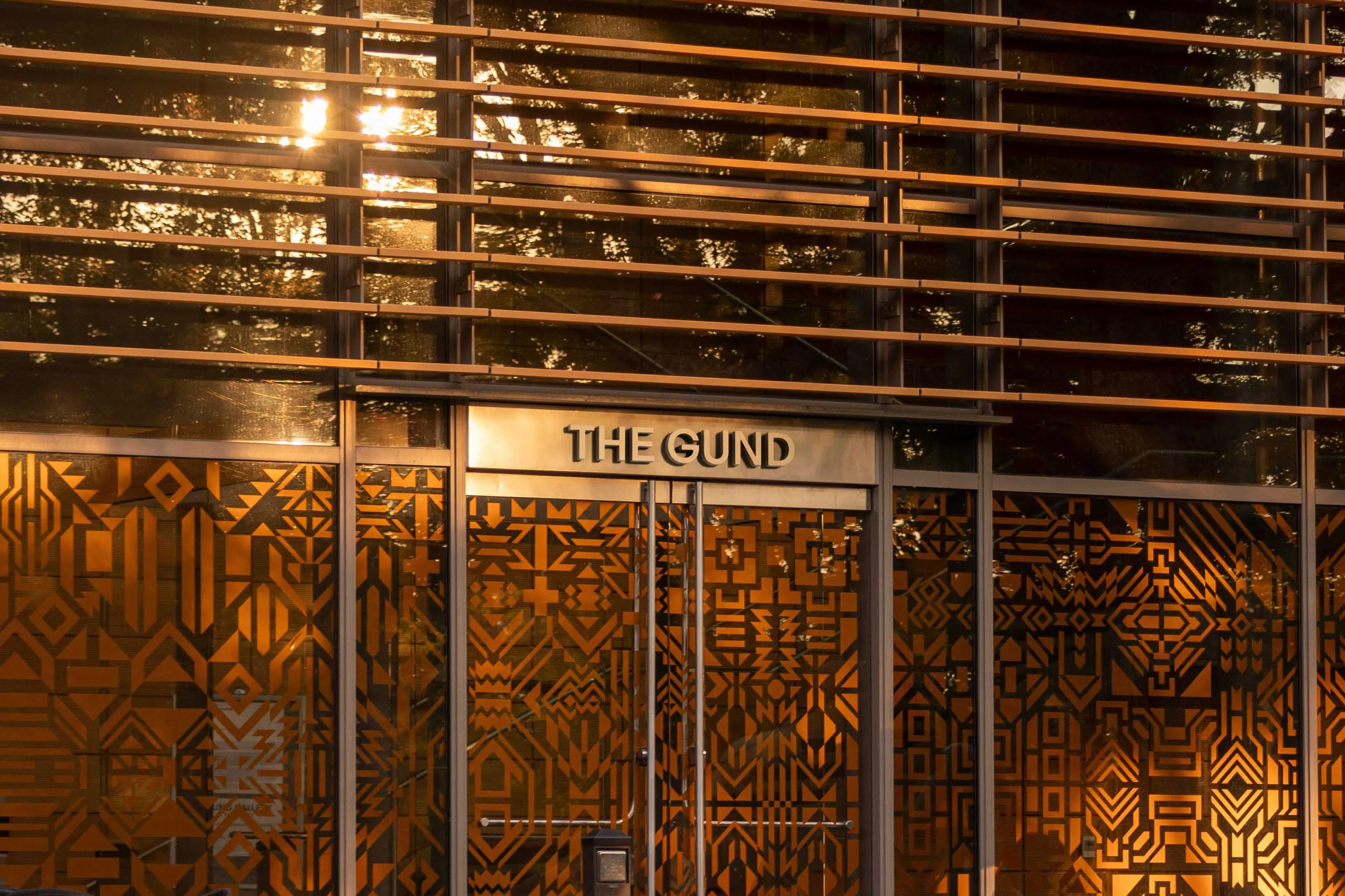
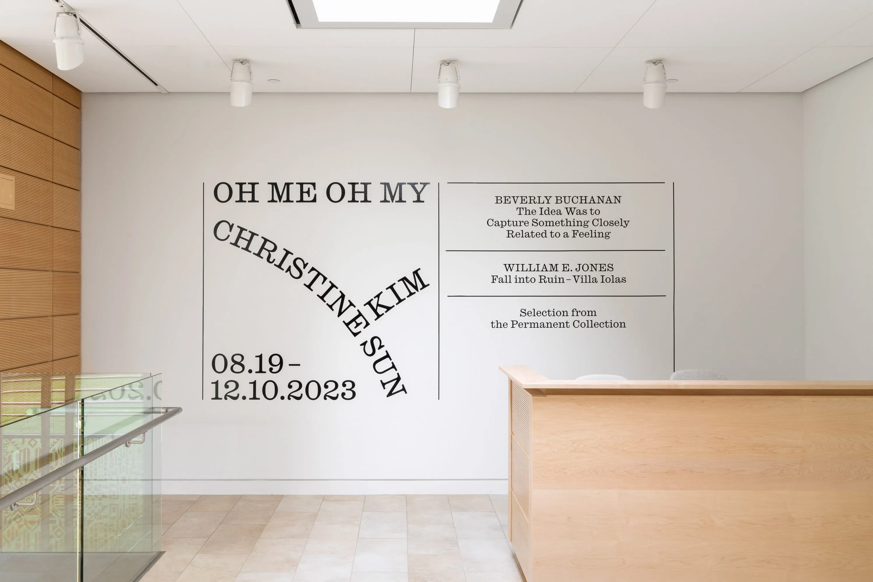
The identity system is inspired by both language and architecture, drawing on Kenyon College’s reputation as "The Writers' College" and the gallery’s striking building, designed by architect, philanthropist and Kenyon College alumnus Graham Gund.
Along with a bold logo mark and dynamic graphic system, Principal has also designed a new website (thegund.org) and custom typography for The Gund. The wordmark aims to exude simple, understated elegance, while still being welcoming and timeless.
This new digital platform will ensure the dissemination of the museum's innovative initiatives. It acts as The Gund’s “second building,” functioning as a lively hub for students, visitors, and the local community. It also serves as a platform to amplify the institution’s voice and engage with the broader art world, attracting new artists and fostering connections.
The new name signals a profound transformation as the organization enters its dynamic second decade, poised to establish a more prominent presence on the global art stage. The graphic system acts as a “design expression dimmer” ranging from restrained to expressive, allowing the gallery to express itself and for the artists’ work to remain the focus. Friendly and welcoming, Gund Sans was created as a primary typeface. “Principal’s contribution was absolutely key to the strategic and creative success of this project, and the unwavering support of the charming, dedicated and inspired team made this journey an absolute joy.” –Daisy Desrosiers, director and chief curator, The Gund
Credits
Creative Direction: Bryan-K. Lamonde
Web Creative Direction: Bruno Cloutier
Design: Julien Hébert, Nick Losacco, Camille Beauchamp-Yergeau, Mali Savaria-Ille
Web Design: Nick Losacco, Julien Hébert
Development: Jules Renaud, Damien Espana
Project Management: Justine Crépeau-Viau
Coordination: Chloé Miglierina
Technology Direction: François Morin
Account Direction: François Morin
Typefaces
Gund Sans by Julien Hébert
Caslon Ionic by Commercial Type
Simon Mono by Dinamo
Awards & Mentions
IDÉA 2024, Grand Prix, Gold