The Gund (previously Gund Gallery) at Kenyon College in Ohio has launched its new brand identity, designed by Principal. The new name and fresh look reflects the breadth of initiatives, spaces, and programming—on campus and beyond, placing The Gund “in the middle of everywhere”.
It's been a privilege to be trusted with the rebrand of The Gund, one of the great academic museums located in a campus with more than 200 years of history. We were invited to work on this project following the appointment of Director and Chief Curator and fellow Montrealer Daisy Desrosiers.
The rebrand supports Daisy’s mission to reimagine how a teaching museum advances creativity, illuminates our shared humanity, and responds to the vital issues of our time. She says the new identity will “help us to communicate a renewed confidence in who we are.”
The new identity, spanning multiple platforms, reaffirms The Gund’s commitment to continued institutional growth and the pursuit of new approaches that exemplify excellence and innovation among college art museums nationwide.
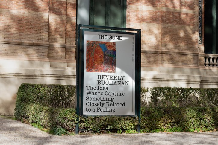
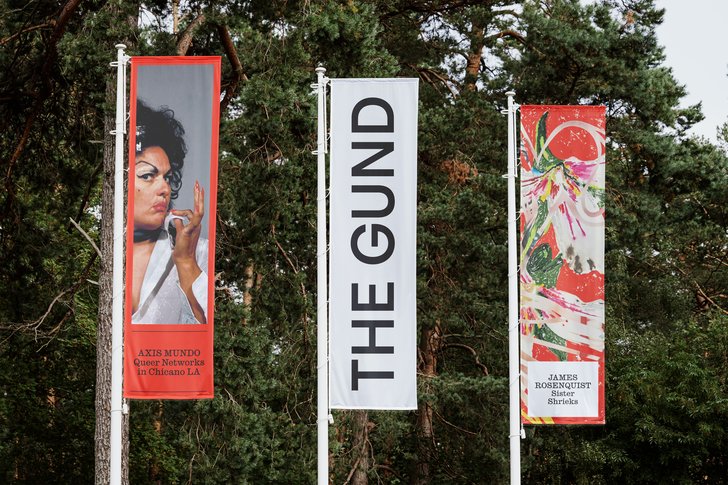
The identity system is inspired by both language and architecture, drawing on Kenyon College’s reputation as "The Writers' College" and the gallery’s striking building, designed by architect, philanthropist and Kenyon College alumnus Graham Gund.
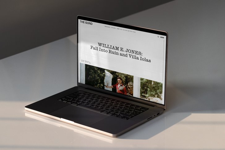
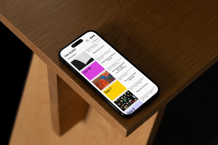
Along with a bold logo mark and dynamic graphic system, we have also designed a new website (thegund.org) and custom typography for The Gund. The wordmark aims to exude simple, understated elegance, while still being welcoming and timeless.
A new name, “The Gund”, signals a profound transformation as the organization enters its dynamic second decade, poised to establish a more prominent presence on the global art stage. This shift accentuates the organization's dedication to maintaining the highest standards of museum practice.
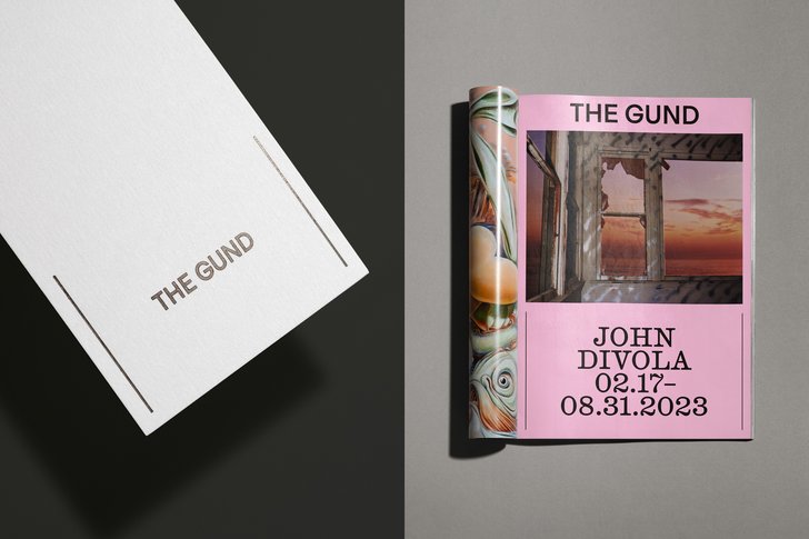
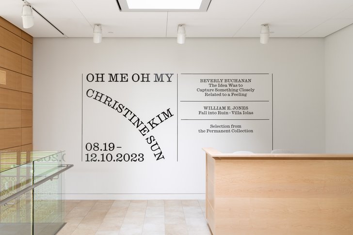
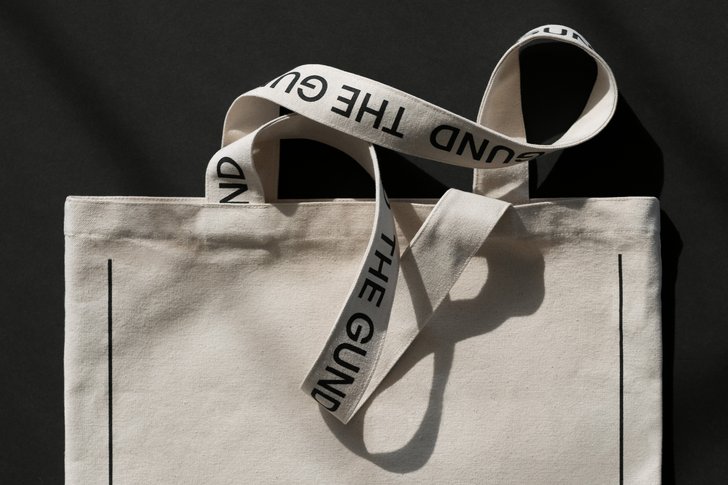
The graphic system acts as a “design expression dimmer” ranging from restrained to expressive, allowing the gallery to express itself and for the artists’ work to remain the focus. Friendly and welcoming, Gund Sans was created as a primary typeface.
The newly designed website acts as The Gund's “second building,” functioning as a lively hub for students, visitors, and the local community. It also serves as a platform to amplify the institution's voice and engage with the broader art world, attracting new artists and fostering connections and conversations.
But there’s more!
Alongside a brand refresh, The Gund has launched The Annex this month, a satellite space that explores how an academic art museum can build bridges, and explore what it means to "learn with art" as a community through programs informed by The Gund’s exceptional permanent collection.
The Annex identity design embodies the welcoming spirit of a friendly neighbor, providing a relaxed and approachable atmosphere for both avid museum visitors and curious newcomers alike. The focus is on simplicity, playfulness, and putting the art at the forefront.
Daisy shared these kind words about the project, “Principal proved to be the ideal partner to take on this challenge as our institution enters its second decade. Their contribution was absolutely key to the strategic and creative success of this project, and the unwavering support of the charming, dedicated and inspired team made this journey an absolute joy.”
As for us, we're proud to provide The Gund with a complete and versatile graphic system and toolkit that will allow it to express the full range of its rich and dynamic identity.